Simplicity in Branding: The Secret Behind Memorable Brands
Deepak Singh Ola
07-01-2026
In a world that is becoming increasingly difficult to navigate, capturing attention has never been more challenging. Every day, consumers are bombarded with a constant stream of messages, content, and products. Yet, amid this noise, certain brands stand out effortlessly. Their names, colors, and symbols feel instantly familiar. Think of the bitten apple, the simple swoosh, or the red and white script that needs no explanation.
Have you ever wondered what makes these brands so memorable?
It’s simplicity.
Simplicity in branding is not about removing personality or stripping away design for the sake of minimalism. It is a deliberate act of focus. A simple brand says exactly what it needs to say without asking the audience to work for it. It removes noise so that the idea at the heart of the brand can take center stage.
As attention spans shrink and choices multiply, simplicity has transformed from a design preference into a strategic necessity. Simplicity is about clarity and intention. It means stripping away the unnecessary so that the essential can shine through. Every aspect of a brand, from its name, logo, and visual identity to its voice and customer interactions, should reflect a single, well-defined idea. Simple brands are easier to understand, easier to remember, and easier to trust. They save the audience time and effort.
One of the first points of contact with any brand is its name. The strongest brand names are short, memorable, and easy to pronounce. Nike, Apple, Uber, Sony, and Lego are clear examples. They stay in the mind because they create no friction and require no explanation. Complicated names slow people down or cause uncertainty, which opens the door for attention to slip away. A simple name becomes familiar more quickly and integrates naturally into everyday speech.
Simplicity matters just as much visually. In visual perception, the brain reads the shape first, then the colors, and then goes for the content. This sequence shows why simple branding works so well. A logo with a clear, recognizable shape is easier to register and remember. A clean and limited color palette reinforces that shape rather than competing with it. Finally, simple wording or messaging ensures that nothing interrupts understanding. When all three elements are stripped back to their essentials, the brain can absorb the brand instantly and without effort.
Simplicity in branding, especially in logo design often leads to the misconception that it might be a quick and easy process. In reality, achieving a simple design takes comparatively more time and effort. Sometimes people say, well a six-year-old could draw it. That reaction is actually a sign of success. A logo that a child can sketch from memory is the ultimate test of simplicity. Getting to that point, however, takes time and hard thinking. The more straightforward a logo looks, the higher the likelihood that similar concepts are already in use. This means designers have to spend a lot of time ensuring that their creations are original and not infringing on existing trademarks. A simple logo might appear effortless, but it requires extensive research and refinement to stand out uniquely.\
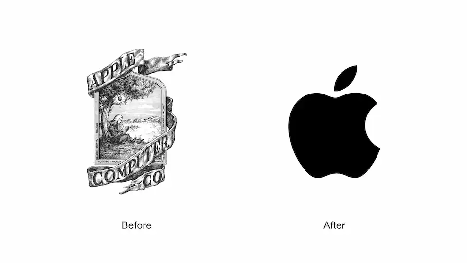
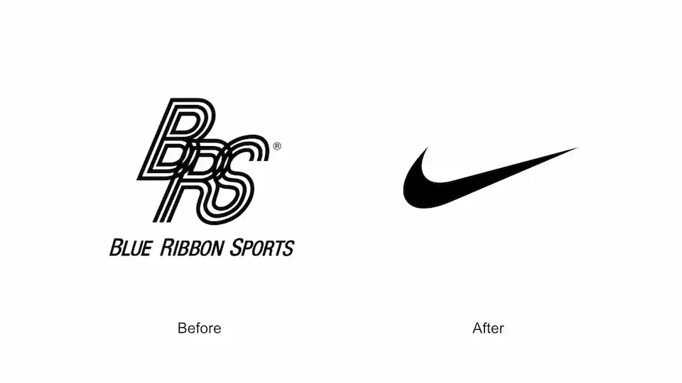
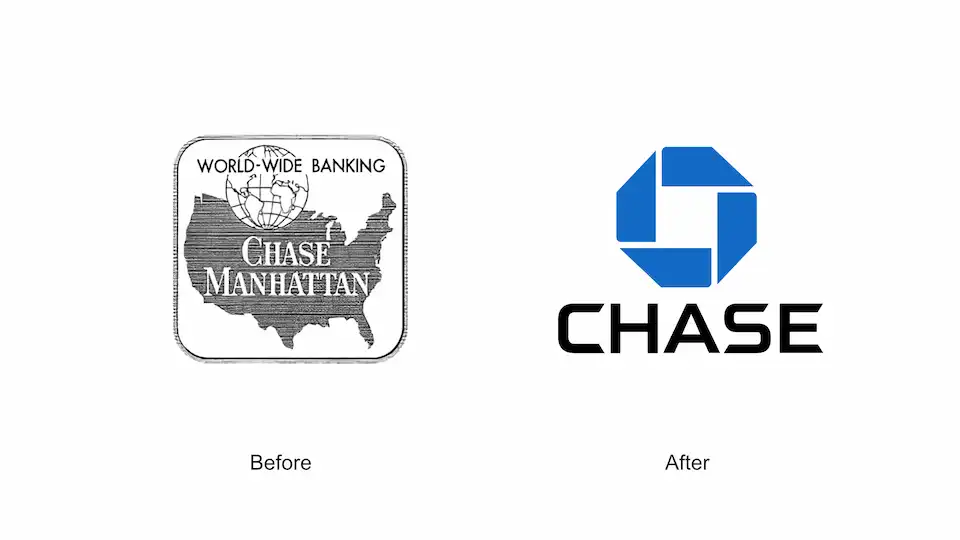
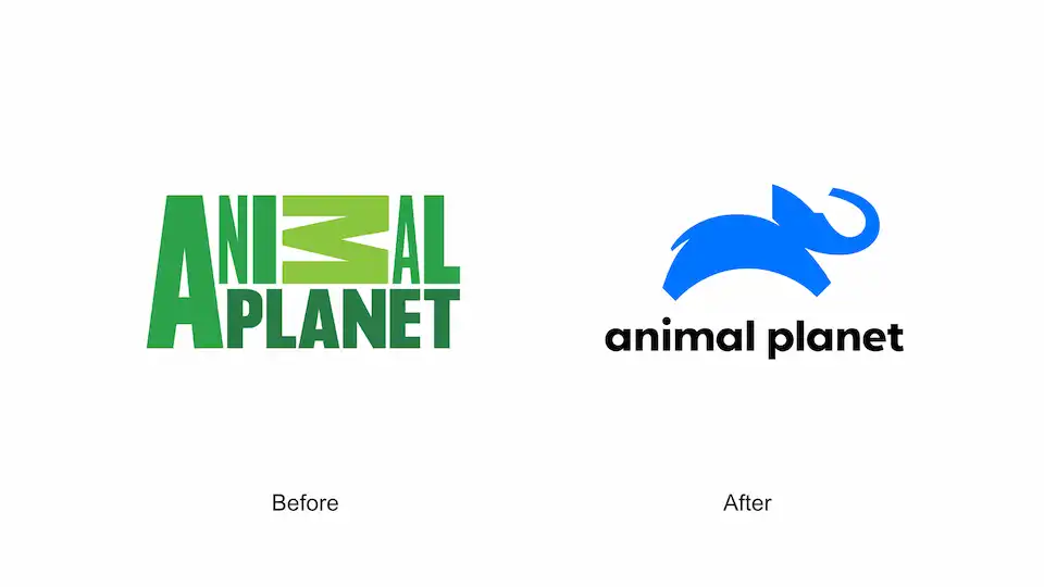
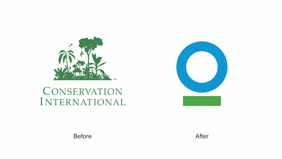
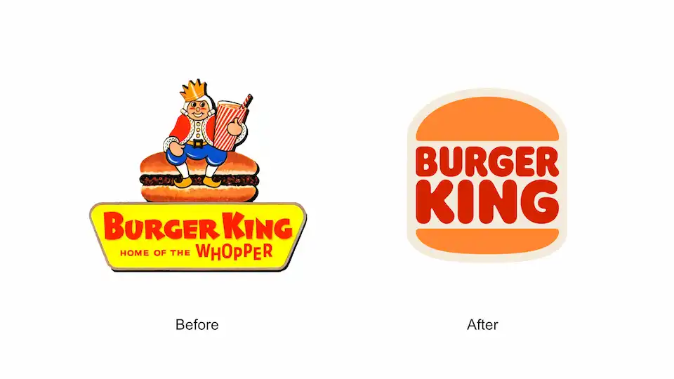
Many of the most recognizable brands did not start simple. They became simple over time. As companies grow and understand themselves more clearly, their branding often strips away the unnecessary. Logos are refined, naming is simplified, and visual identities become cleaner and more focused. This evolution is proof that simplicity is not a shortcut but a journey toward success. These are some well known brands that have evolved from complex identities to simpler expressions.
- Apple
- Nike
- Chase bank
- Warner Bros

- Animal Planet
- Conservation International
- Burger King
In a world full of noise, simplicity becomes a powerful signal. It allows a brand to be recognized quickly, understood easily, and remembered for the right reasons. It gives people space to notice what matters most. When a brand chooses clarity over clutter, it quietly earns a place in people’s minds and lives.
At The Branvetica, simplicity guides every decision we make. Our naming, logo, color, and messaging choices are intentional and focused, with the goal of creating brands that are simple, memorable, appropriate, and distinctive. We design identities that stand out, communicate clearly, and remain confident over time.
If your brand feels cluttered, confusing, or hard to explain, simplicity is the solution. Whether you’re starting fresh or reshaping what already exists, we are here to help you focus on what matters most and express it with clarity. Contact us to explore how we can bring your vision to life through thoughtful, purposeful simplicity.