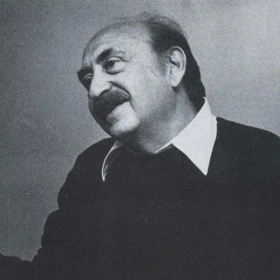
Saul Bass (1920 – 1996) was an American graphic designer and filmmaker, renowned for his innovative work in film title sequences, posters, and corporate logos. His career spanned over four decades, during which he collaborated with some of Hollywood's most influential directors, including Alfred Hitchcock, Stanley Kubrick, Otto Preminger, and Martin Scorsese.
Born in the Bronx, New York, Saul Bass demonstrated artistic talent from a young age. He graduated from James Monroe High School and pursued studies at the Art Students League in Manhattan, later attending Brooklyn College, where he studied under György Kepes, a significant influence on his design philosophy.
Bass began his career in advertising and print design in the 1940s, working for agencies in New York. He eventually moved to Los Angeles, where he opened his own design studio. It was in Hollywood that he found his greatest opportunities, blending graphic design with motion pictures in a way that no one had done before. Until then, film title sequences were often simple lists of names with little thought given to visual impact. Bass transformed them into an art form, using movement, typography, and bold imagery to set the tone of a film before the first scene even began.
His breakthrough came in 1954 with the title sequence for Carmen Jones, directed by Otto Preminger. Impressed by his work, Preminger hired him again for The Man with the Golden Arm (1955), where Bass designed a striking animated sequence featuring jagged white lines representing a drug addict’s arm. This title sequence shocked audiences and critics because it treated the credits as part of the storytelling rather than an afterthought. From then on, Bass became the go-to designer for some of the greatest directors in Hollywood.
He went on to design unforgettable title sequences for Alfred Hitchcock’s Vertigo (1958), North by Northwest (1959), and Psycho (1960). Bass also worked with Martin Scorsese on Goodfellas (1990), Cape Fear (1991), and Casino (1995). Through his use of motion graphics, typography, and minimal imagery, he revolutionized how audiences experienced the opening minutes of a film.
In addition to title sequences, Bass created some of the most iconic film posters of the twentieth century. His poster for Anatomy of a Murder featured bold typography and abstract human shapes that captured the tension of the story. His poster for Vertigo, with its swirling vortex and tiny falling figure, remains one of the most famous pieces of publicity design ever created. Unlike many posters that relied on photographs of the actors, Bass used graphic symbolism to capture the emotional core of the film.
Bass was not limited to the world of cinema. He also became a major figure in corporate identity design, creating logos that have lasted for decades. He designed the AT&T “bell” logo in 1969 and later its globe logo in 1983. He created the logo for Continental Airlines, United Airlines’ “tulip” mark, Minolta, Warner Communications, and Girl Scouts of the USA, among many others. Like Paul Rand, Bass understood that a logo should be simple, memorable, and timeless. His corporate work showed the same clarity and boldness as his film design.
Beyond design, Saul Bass also worked as a filmmaker. He directed the short film Why Man Creates in 1968, which won the Academy Award for Best Documentary Short Subject. The film was a playful and thought-provoking exploration of creativity, using animation and mixed media to examine why humans invent, design, and imagine. Later he directed the feature-length science fiction film Phase IV (1974), which told the story of intelligent ants threatening human survival. Although it was not a commercial success, it gained a cult following for its unusual visual style and surreal ending.
Throughout his career, Bass believed that design should be functional, expressive, and direct. He often spoke about stripping down visual communication to its essential elements. Whether he was designing a film poster, a logo, or a title sequence, he aimed to create images that would stay in the mind of the viewer. His designs were bold and modern but also human and emotional.
Saul Bass passed away in 1996, but his influence continues to shape both graphic design and film. The way movies use opening titles today owes much to his vision. His logos remain in use, his posters are still collected, and his ideas are taught in design schools around the world. Designers and filmmakers alike look to his work as proof that simplicity, clarity, and symbolism can be more powerful than complexity.
Logos designed by Saul Bass :


