Queen Logo History and Design
Deepak Singh Ola
01-12-2025
Freddie Mercury once said he wanted Queen to look “regal and majestic,” a statement that still echoes in every line and curve of the band’s visual identity. I’ve always found that intriguing. Most rock logos shout. Queen’s logo behaves differently. It feels institutional, authoritative, and royal. And yet, for all its ceremony, it has never been as memorable as the band’s music.
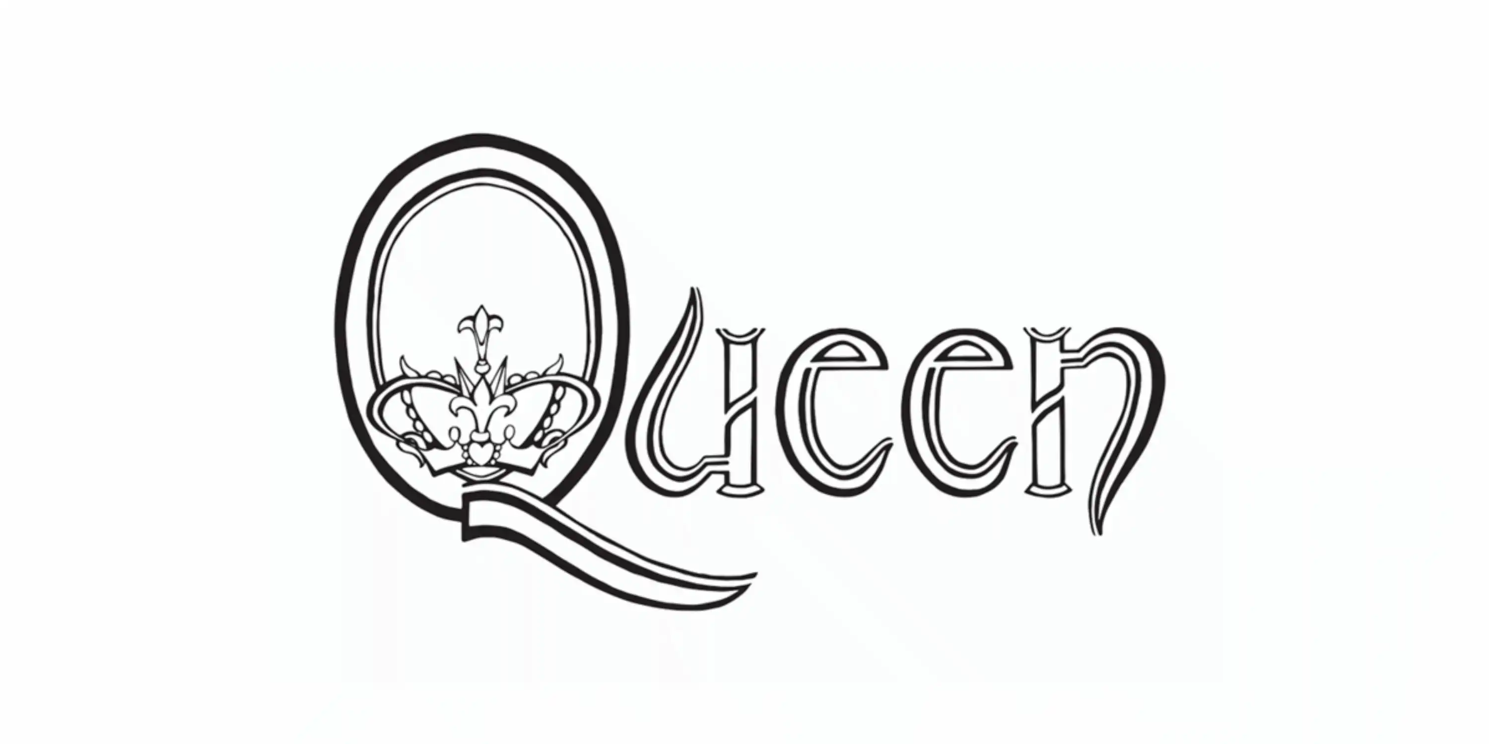
The Queen logo is a combination mark consisting of a crest and a serif logotype. The crest is dramatic, ornate, symbolic, and incorporates the band members' zodiac signs (lions, fairies, and a crab) along with a crown inside the Q and a phoenix. As an artwork, the crest is beautiful. It feels handcrafted and deeply personal. The heraldic composition along with an elegant serif logotype gives a royal feel. It aligns with the band’s ambition to present themselves as majestic and larger-than-life performers. But as a logo, the complexity works against it. There’s so much happening that the overall silhouette becomes hard to parse at a glance. Logos must be instantly recognizable and easily reproducible across diverse media at various sizes to succeed as effective branding. The Queen crest, with its dense composition and fine details, falls short on these practical criteria, making it less memorable and harder to recall or replicate quickly. This limitation emphasizes why a balance between meaning and visual clarity is essential in logo design, especially for bands seeking strong brand identity and broad audience recognition.
The Queen logo was designed by Freddie Mercury himself in 1972, long before Queen reached global fame. Freddie studied graphic art and design at Ealing Art College in London, graduating with a diploma in 1969. His formal training in art and design helped him create an illustrative emblem that incorporated the band members’ zodiac signs, arranged in a heraldic style. However, the logo was more of a personal and artistic emblem than a formally structured branding or visual identity system.
Interestingly, the first Queen wordmark was much more restrained. This logo is often overlooked, but it deserves more attention. It appeared on Queen’s first album cover in 1973 and was also drawn by Freddie. Clean serif letters, elegant and straightforward. It sits quietly on the debut album, confident but not showy. It is more memorable than the crest in many ways. Simpler. Clearer. Easier to identify from a distance. Still, it wasn’t perfect as some curves feel inconsistent. With a few adjustments in weight and proportion, it could have been sharp enough to rival the great rock wordmarks of its era.
If Queen had kept iterating on that early lettering, we might have ended up with a timeless wordmark that could stand shoulder to shoulder with Led Zeppelin or AC/DC. Instead, the crest became the face of the band, and its ambition became its legacy.
There’s value in revisiting these logos today. Not just as nostalgia, but as a reminder that branding thrives at the intersection of meaning and clarity. The Queen crest excels at meaning. The early wordmark excels at clarity. Somewhere between those two lies a version of Queen’s identity that could have been even more iconic. And honestly, that tension is what makes the story of these logos so compelling.