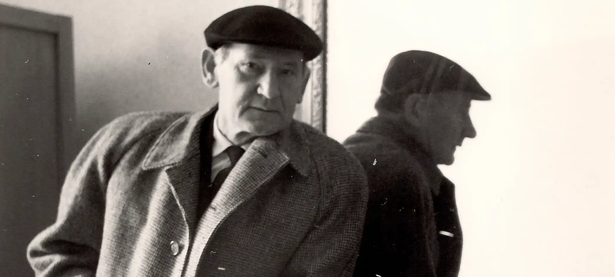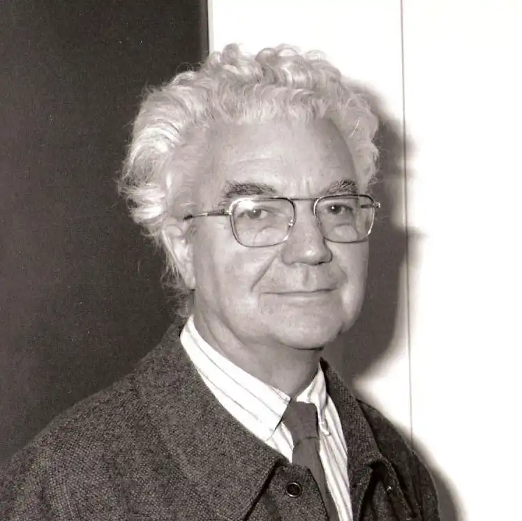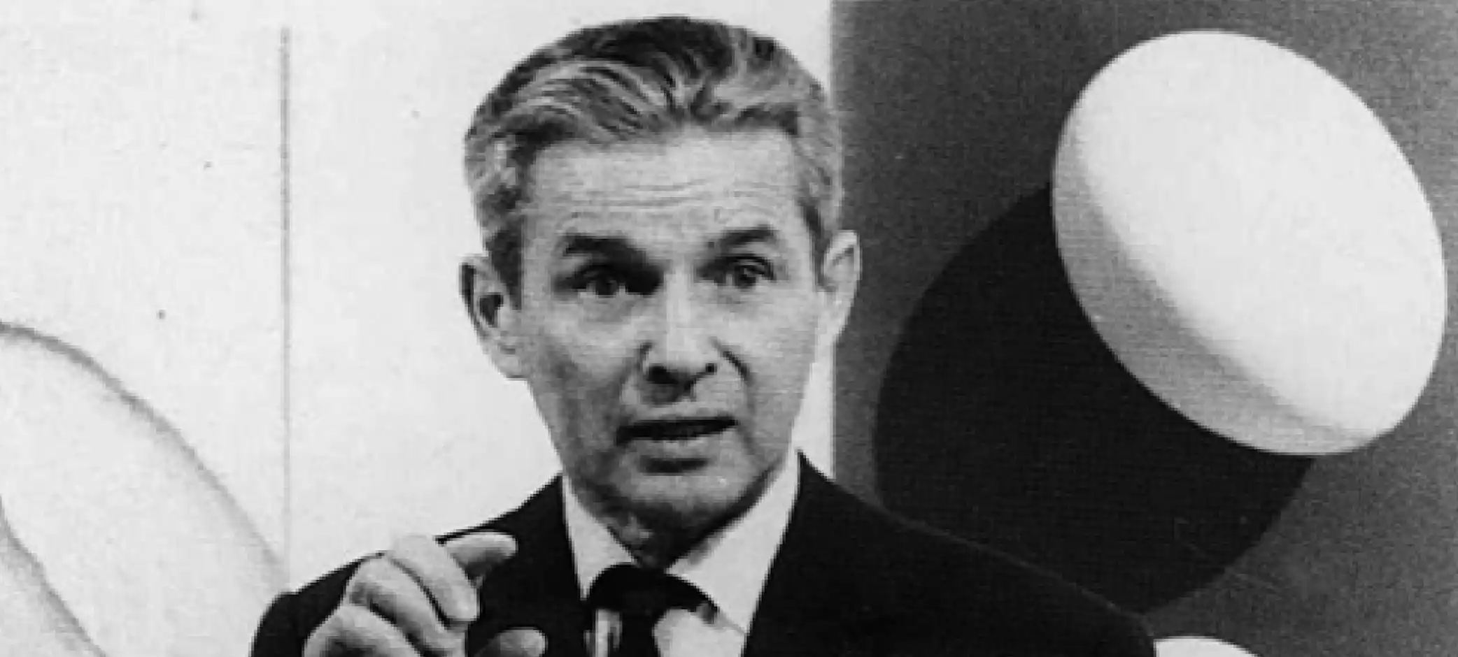
Josef Müller-Brockmann (1914 – 1996) was one of the most influential graphic designers of the twentieth century. Born in Rapperswil, Switzerland, he became widely known for his role in shaping the International Typographic Style, also called the Swiss Style. His work in poster design, typography, and teaching created a new visual language that continues to influence designers across the world today. His name is often mentioned alongside the greatest figures in modern design because he managed to combine clarity, simplicity, and order in a way that felt timeless.
Josef Müller-Brockmann studied architecture, design, and art history at the Kunstgewerbeschule in Zurich. While his early training gave him a wide perspective, it was graphic design that captured his full attention. By the early 1940s, he had opened his own studio in Zurich, where he began to create work that challenged the decorative and illustrative traditions of the time. He was interested in using design not for personal expression, but as a means of clear and universal communication. This idea would become central to his philosophy throughout his career.
One of the defining characteristics of Josef Müller-Brockmann’s work was his use of the grid system. He believed that a grid provided both structure and freedom. By dividing a layout into consistent, mathematical units, he made it possible to organize type, images, and space in a way that was both logical and aesthetically pleasing. The grid became a tool that allowed information to be presented in a clear and objective manner. He published his famous book "Grid Systems in Graphic Design" in 1961, which is still considered a standard reference for designers and students around the world.
Josef Müller-Brockmann’s posters, particularly those for the Zurich Tonhalle concert hall, brought him international recognition. These works often used bold photography, geometric forms, and dynamic compositions to convey rhythm and harmony. Instead of relying on illustration, he turned to abstraction and photography as a way to represent music and cultural themes. His posters were striking because they were stripped down to essentials. Every line, every typeface, and every visual element served a purpose. This economy of design was not just about style but about creating communication that could be understood by anyone regardless of language.
Typography was another cornerstone of his approach. He was an advocate of sans-serif typefaces, especially Helvetica, which became synonymous with the Swiss Style. For Josef Müller-Brockmann, typography was not decoration but a tool for clarity. He paid attention to spacing, alignment, and proportion, believing that the arrangement of type on a page should follow the same logic as architecture. This precision gave his work a sense of neutrality and timelessness.
Beyond his design practice, Josef Müller-Brockmann was a teacher and writer who shared his knowledge with generations of students. He taught at the Zurich School of Arts and Crafts and wrote extensively about design theory. His writings explained complex design principles in simple and direct terms. Books such as "The Graphic Artist and His Design Problems" and "History of the Poster" helped spread the Swiss Style far beyond Switzerland. Through his teaching and writing, he ensured that the ideas of order, function, and simplicity would shape modern design education.
In 1958, Josef Müller-Brockmann co-founded the magazine "Neue Grafik" together with Richard Paul Lohse, Hans Neuburg, and Carlo Vivarelli. This publication became the most important platform for promoting the International Typographic Style. It presented essays, examples of work, and theoretical discussions that reached designers across Europe and beyond. The magazine played a crucial role in establishing the Swiss Style as an international movement.
Josef Müller-Brockmann’s influence also extended into the corporate world. As businesses began to expand globally in the mid-twentieth century, they needed clear and consistent visual identities. The grid system and the principles of the Swiss Style provided exactly that. Many corporate identity programs and branding systems from the 1960s and 1970s can be traced back to the ideas he promoted. His belief in rational design matched the growing demand for professionalism and consistency in business communication.
Although his work is often described as minimal, Josef Müller-Brockmann did not see design as reduction for its own sake. For him, the goal was to remove anything unnecessary so that the essential message could shine through. This principle gave his posters, books, and identities a sense of honesty and directness. His designs were not trying to impress but to communicate. In a world filled with visual noise, this clarity was powerful.
Josef Müller-Brockmann continued to work and teach for decades. He remained active until the end of his life, producing designs and advising younger generations. He passed away in 1996, but his legacy remains alive in classrooms, studios, and design systems everywhere. His grid approach is still taught as a foundation of graphic design education. The clarity and balance of his work continue to serve as examples of what design can achieve when it respects both function and form.