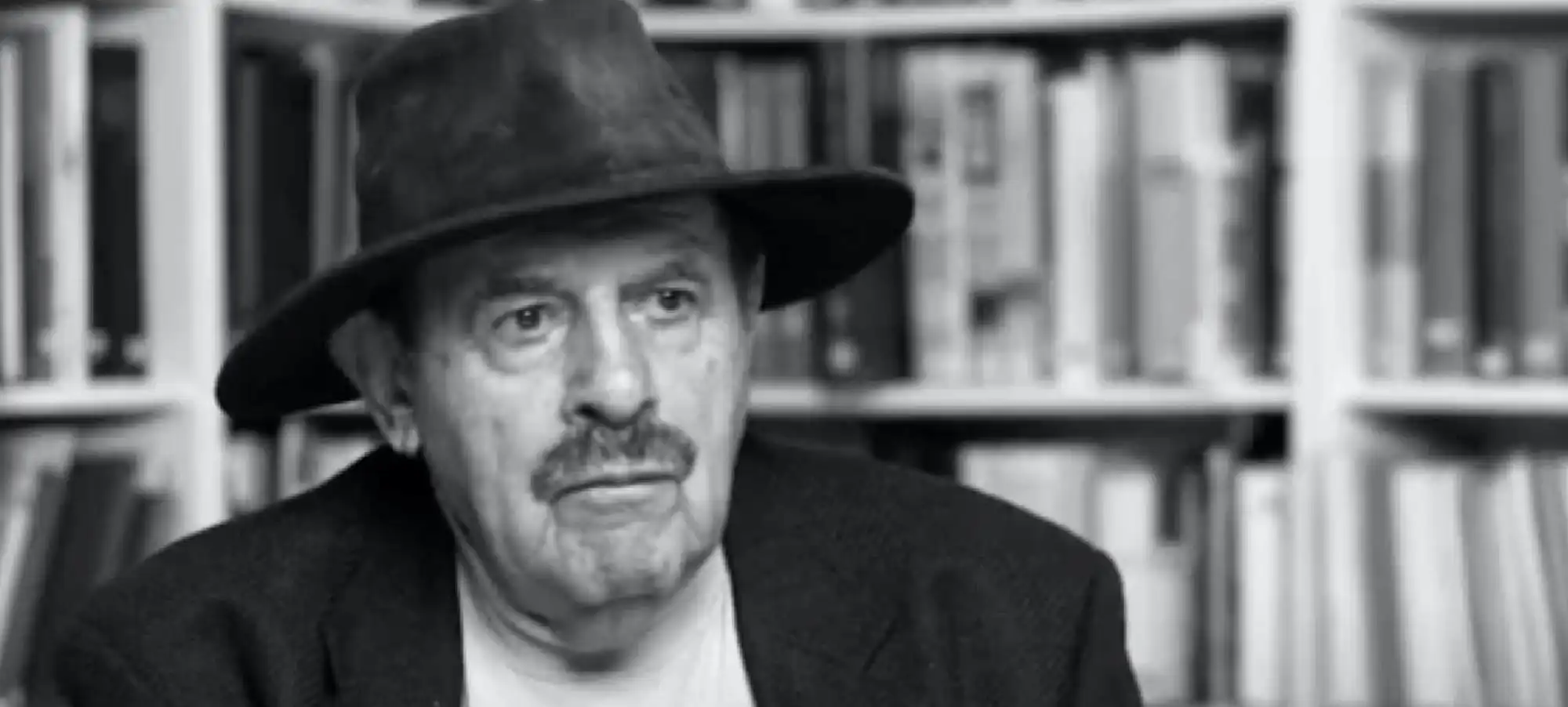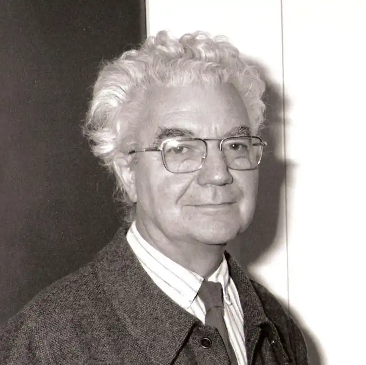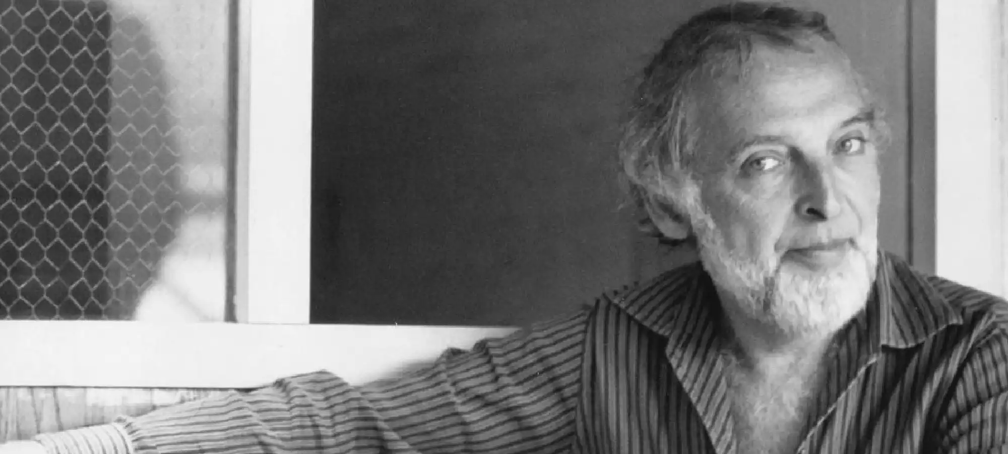
Herb Lubalin (1918 – 1981) was an American graphic designer whose inventive use of typography and expressive approach to design transformed the field in the mid-twentieth century. Born in New York City in 1918, Lubalin developed a fascination with letterforms at an early age and went on to study at Cooper Union, graduating in 1939. His career would span advertising, editorial design, type design, and corporate identity, with a body of work that continues to influence how designers think about the expressive potential of type.
After finishing school, Lubalin briefly worked at Reiss Advertising and then joined Sudler & Hennessey in 1945, where he spent 19 years as an art director. At Sudler he became known for his innovative ad campaigns and for mentoring young creative talent. Among his colleagues were Andy Warhol, photographer Art Kane, and designer John Pistilli, who would later co-design the elegant typeface Pistilli Roman with Lubalin in 1964. While at Sudler, Lubalin collaborated with John J. Graham to create the original NBC Peacock in 1957, a design that remains one of the most recognizable symbols in American broadcasting history. He also redesigned the Saturday Evening Post in 1961, creating a bold new trademark for the magazine, an effort that was celebrated in a Norman Rockwell cover illustration.
In 1964, Lubalin left Sudler to start his own firm, Herb Lubalin, Inc. This move allowed him to expand into a wide range of projects, from packaging and advertising to posters, logos, and magazines. One of his early achievements was the co-design of Pistilli Roman, a photocompositor typeface with John Pistilli, which appeared in the visual identities of Lincoln Center, the Metropolitan Opera, and the New York Philharmonic. Lubalin also designed the trademark for the World Trade Center at its opening in 1973, showcasing his ability to create iconic corporate identities.
Lubalin’s most celebrated work came from his long collaboration with publisher Ralph Ginzburg. Together they produced a series of groundbreaking magazines that challenged both cultural norms and design conventions. Eros, published in 1962 and 1963, was devoted to themes of sexuality and romance. It was lavishly produced with high-quality paper and no advertising, and Lubalin’s layouts gave it the feel of a collectible art book rather than a commercial magazine. However, its frank treatment of erotic content drew the attention of U.S. authorities, leading to obscenity charges that shut the magazine down after only four issues.
In 1964 Ginzburg and Lubalin launched Fact, a political and social commentary magazine with a minimalist typographic design that reflected its sharp and critical content. Lubalin used serif typefaces, black and white printing, and restrained layouts that stood apart from both glossy mainstream magazines and sensationalist tabloids. Fact published bold and controversial stories, including a notorious 1964 issue questioning presidential candidate Barry Goldwater’s fitness for office. Goldwater sued and won damages, which bankrupted the publication.
Despite these setbacks, Lubalin and Ginzburg achieved their greatest success with Avant Garde, launched in 1968. The magazine combined progressive cultural content with daring design. Its logo, designed by Lubalin, used tightly spaced custom ligatures to solve the difficult letter combinations in the title. The demand for a complete alphabet in this style was so high that Lubalin and his collaborator Tom Carnase released ITC Avant Garde Gothic in 1970, through the newly founded International Typeface Corporation. While the typeface was widely adopted, critics like Steven Heller later noted that its many ligatures were often misused by designers who lacked Lubalin’s sensitivity. In Lubalin’s hands, however, Avant Garde represented a bold and futuristic approach to typography that captured the spirit of the era.
In 1970 Lubalin co-founded ITC with Aaron Burns and Edward Rondthaler, aiming to adapt type design for phototypesetting technology and make new fonts available to a global audience. He served as creative director of ITC’s influential journal U&lc (Upper and Lower Case), launched in 1973. The publication became a platform for typographic experimentation, filled with layouts and compositions that blurred the line between text and image. For designers of the 1970s and 1980s, U&lc was a constant source of inspiration and a showcase for Lubalin’s philosophy that typography should be expressive, not neutral.
Beyond magazines and typefaces, Lubalin created many logos and trademarks that are still admired for their wit and clarity. His designs for Mother & Child, Families, and Marriage cleverly turned letters into symbols of human relationships, demonstrating his genius for combining meaning and form. He also developed logos and visual identities for Reader’s Digest, New Leader, PBS, Revlon, and his alma mater Cooper Union. Each design showed his belief that typography could communicate personality as powerfully as imagery.
Herb Lubalin’s career was recognized with numerous honors, including induction into the Art Directors Hall of Fame in 1980 and multiple awards from the Art Directors Club and AIGA. He was also a dedicated teacher, returning to Cooper Union as a faculty member to mentor young designers. His influence extended far beyond his own studio, as his approach to typography redefined the possibilities of graphic design.
Lubalin passed away in 1981 at the age of 63, but his work continues to inspire. From the expressive layouts of Eros and Avant Garde to the enduring popularity of ITC Avant Garde Gothic and the pages of U&lc, his designs showed that typography is not just about legibility but also about emotion, storytelling, and cultural impact. Herb Lubalin remains one of the most celebrated American graphic designers, a pioneer who gave letters a voice and proved that words themselves can be works of art.